Design Process
How I think, design and build digital products
General Approach
When approaching a new UX design project, I follow an iterative and scalable process, adapting it to the type of product and its duration.
In the initial phase, the focus is on:
- Gathering information and understanding the product context
- Defining a scalable layout and information architecture
- Establishing an initial look & feel proposal
Once development starts and core functionalities are defined — or a functional design already exists — I select a representative slice of the product and create a UX proposal aligned with that scope. This includes interaction wireframes and, once approved, the final mockups.
With a clear design direction in place, the work continues sprint by sprint, applying the same pattern to new features.
This approach is mainly used for long-term projects (6+ months), especially for:
- B2B applications
- CRMs
- Internal administration tools
- Backoffice platforms
In these projects, end users are usually expert internal users, so UX research is lighter. The requirements are typically defined by stakeholders or Product Owners.
For smaller projects or B2C products, the workflow is simpler and follows a more traditional Design Thinking like methodology.: UX Research, Wireframes, Prototype andTesting.
Architecture and scalability
One of the most important aspects when designing large or complex applications is defining a solid information architecture, layout structure and user flows.
My usual approach includes:
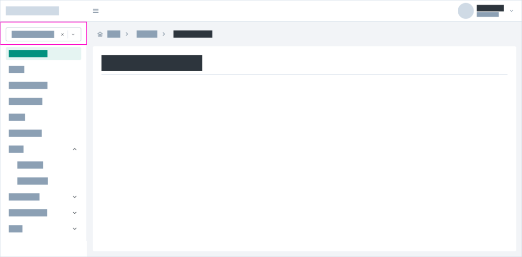
- A sidebar as the main application navigation
- A canvas-style page acting as the main content container
- Breadcrumbs and page titles to clearly indicate user location
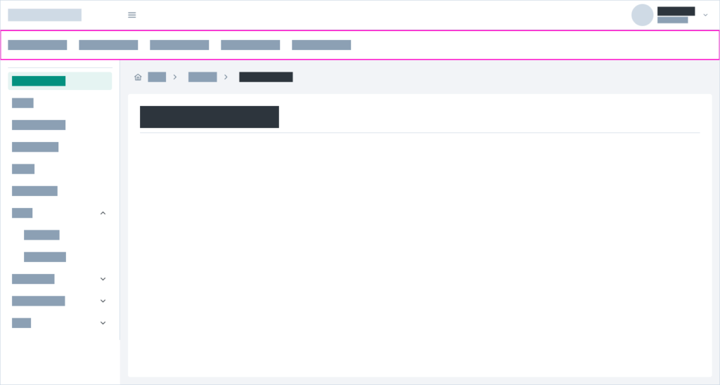
When multiple modules are involved, I use dropdown list or a secondary navigation bar to switch between them.
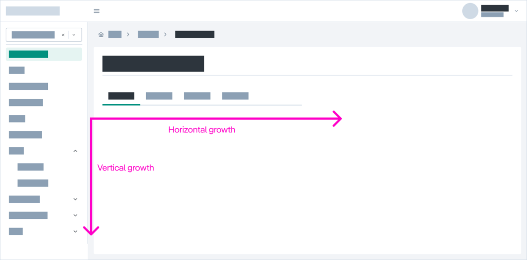
The applications I design are typically scalable on both axes:
- Y-axis: growth adding modules or sections to sidenav
- X-axis: horizontal growth using tabs inside a section
This allows heavy and complex applications to remain manageable and understandable.
Fluid and responsive layout
I work with fluid layouts, where content adapts to the size of its container.
This approach:
- Supports multiple screen sizes
- Avoids designs limited to the typical Figma “happy path”
- Ensures robustness in complex scenarios
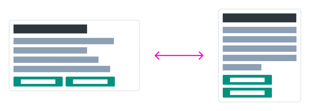
I always design starting from the most demanding case, ensuring the interface doesn’t break under edge conditions.
I try to avoid unnecessary scrolling and ensure compatibility with font size changes. For this reason, I avoid fixed sizes for buttons and text elements.

This mindset also makes the handoff to HTML much smoother. My background in development allows me to anticipate which design solutions will work in real code. One of the most common issues I see is the overuse of fixed dimensions.
Spacing and containers
For layout spacing, I use a base x2 scale:
2, 4, 8, 16, 32, 64, 128…
with one intentional addition: 24px, which experience has shown to be essential for maintaining visual harmony.

All spacing responsibility lies in the containers:
- Containers manage margins and spacing
- Content elements remain clean, without margins
This ensures flexibility and allows content changes without breaking the layout.

Colors
My color system is based on:
- 6 levels of grayscale for interface and default components
- A primary color that complements the standard UI
- A secondary color if it is necessary
- Semanthic colors
Using this color system, I define all UI states: interactive, disabled, hover…
In this way, all states are consistent across all components, improving coherence and helping users quickly understand interactions.
For example, background grays used for dividers and content blocks are always the same, making it easy to recognize non-clickable elements.

Accessibility
Accessibility is considered from the design phase:
- Color contrast
- Minimum element sizes
- Clear interaction states
- Proper use of icons
My experience working with public administration projects has given me a strong foundation in this area.
Design system & Style guide
Based on all the above, I create a component-based design system (UI Kit) in Figma, along with templates and usage patterns to ensure consistent implementation.
Alongside the design system, I prepare a style guide detailing:
- Component usage rules
- When and how to apply them
- Spacing and layout guidelines
- Best practices for different usage patterns
UI development
Finally, I usually propose an open-source dev kit as a base for translating Figma components into real, production-ready components.
These components are developed and documented in Storybook, which acts as the single source of truth and helps maintain consistency and cohesion across the entire application development.